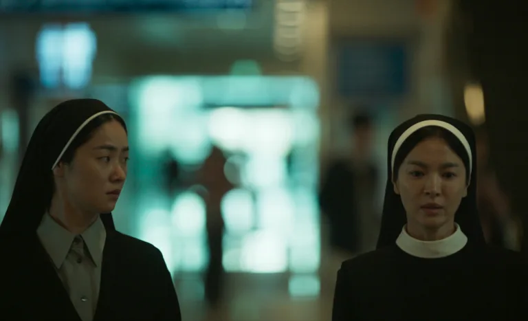
Aspect Ratio 1.66:1
While Hollywood embraced the ultra-wide spectacle of CinemaScope, many of the greatest masters of world cinema chose the 1.66:1 aspect ratio. Offering a more vertical and painterly frame than the American 1.85:1, this format became the signature look of European arthouse cinema. On CinematicFreeze, our 1.66:1 galleries highlight the unique “golden mean” of this frame, a ratio that balances the grandeur of widescreen with the intimacy of a portrait.
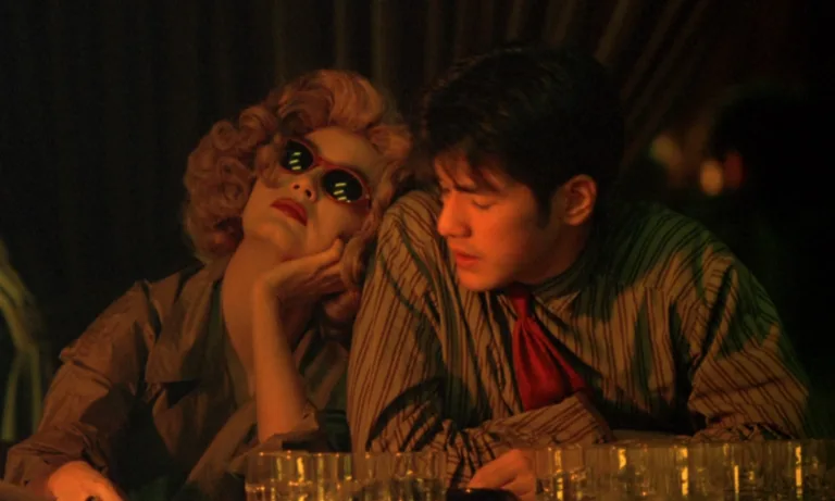
The “Art-House” Frame: Why 1.66:1 is Unique
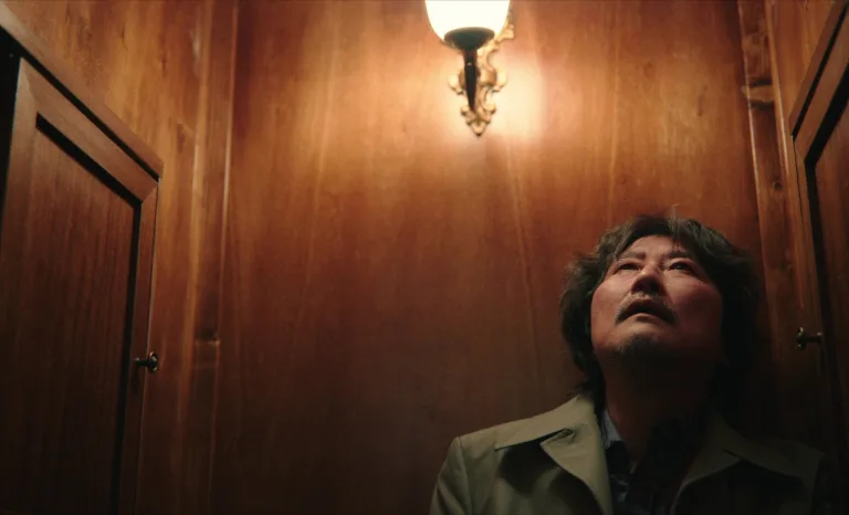
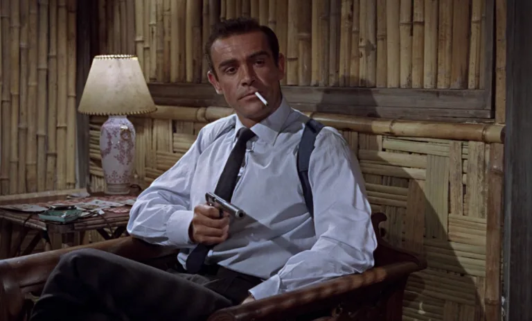
The 1.66:1 ratio is a “tall” widescreen format. In the 1960s and 70s, legendary filmmakers like Stanley Kubrick, Ingmar Bergman, and Jean-Luc Godard favored this ratio because it allowed them to capture the human body and architectural height without the “distracting” horizontal space of wider formats. On a modern 16:9 television, 1.66:1 films will have small black bars on the left and right (pillarboxing), maintaining the director’s original artistic intent.
Essential 1.66:1 Cinematography Galleries
Explore the visual language of the European masters through these curated archives:
- A Clockwork Orange (1971): Stanley Kubrick’s preferred ratio for many of his masterpieces. The 1.66:1 frame allows for his famous “one-point perspective” to feel symmetrical and towering.
- The 400 Blows (1959): A cornerstone of the French New Wave. Henri Decaë used the 1.66:1 frame to follow the movement of youth through the streets of Paris with a natural, unforced grace.
- Seven Beauty (1975): Lina Wertmüller’s work often utilized this ratio to balance grotesque realism with beautiful, tight compositions that feel almost claustrophobic.
Why Cinematographers Choose 1.66:1
This ratio is often chosen for its “academic” and “painterly” feel. It is the perfect middle ground between the “square” past and the “wide” future.
- Ideal for Portraiture: Because the frame is taller than 1.85:1, it is arguably the best widescreen ratio for capturing the human face and upper body.
- Architectural Depth: It excels at capturing tall buildings, staircases, and vertical lines, which is why it was so beloved by directors who focused on set design and urban environments.
- The “Criteron” Look: Many prestige home video labels (like The Criterion Collection) preserve this ratio to respect the specific framing of European classics, making it a favorite for “cinephile” collectors.